Context
When I joined the design team of a large investment firm, my first task was to streamline the design system's icon library. The library predated Figma's instance-swap, boolean properties and Figma variables features. Over time, the design team had struggled to scale this library effectively.
We had roughly 80 icons that needed to support four sizes: 12px × 12px, 14px × 14px, 16px × 16px, and 24px × 24px, along with dark and light modes. To top it all off, the icons were combined as variants, resulting in over 600 variants. Here is a representation of what this Figma file used to look like with only 20 icons
The issues we were facing with scaling this systems
- Adding new icons and maintaining this extensive library was challenging.
- Variants within a component are not searchable and any new designer had to open the design system file to check what options were available.
- Although this was an edge case, the library couldn't support larger icons, such as 72px × 72px or more because the vector layers in this library were still using stroke widths.
The Solution: A Simplified and Scalable Icon System
Simple vectors
I started with converting stroke-based icons into scalable vector shapes, outlining strokes and combining all vector shapes into one.
Tip: When building an icon system, always ensure that the vector layers in all your icons have consistent naming. This name can be anything such as Vector, Shape etc. but it should be consistent across icons. It makes instance swap between different icons much smoother.
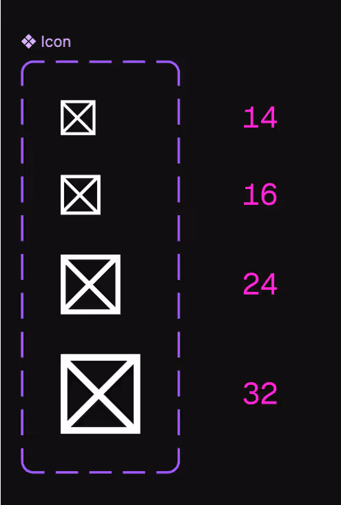
Setting constraints
Once the icons are converted into simple vector shapes, set the vector layer constraints to 'Scale' on both horizontal and vertical axes. This ensures compatibility with all four required sizes in the design system while allowing flexibility for larger icons if needed. Also, be sure to link the height and width properties to maintain proportional scaling.
Icon components
I converted each icon into individual components which we would be able to use for instance-swapping properties later on.
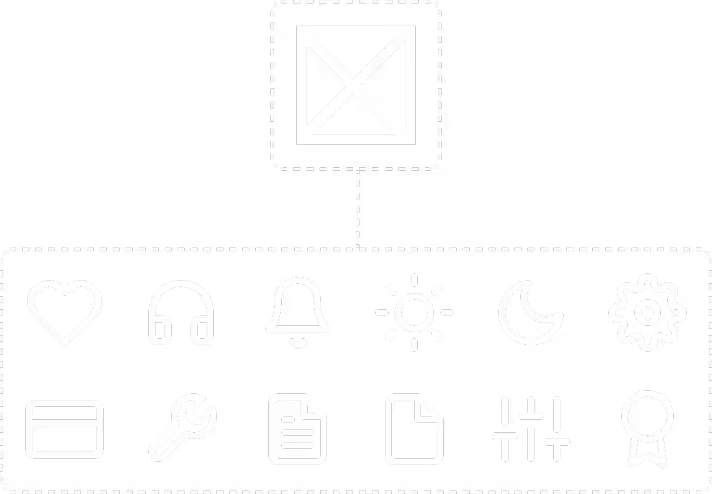
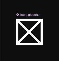
Placeholder icon
I created a simple placeholder icon following the same rules as vector shapes of other icons which would allow us to build a common icon component by using Figma’s in the library instance swap property.
Main icon component
Once our ingredients were ready I created the icon component where I could add the needed the size property(I did not include the light and dark modes here because this will taken care of by our design tokens).
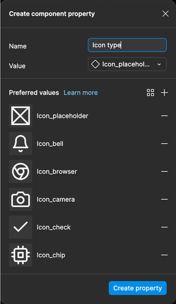
Adding the instance swap property
Now we add the instance swap property which we would use to make all icons in our library available in a single component.
Making search easy
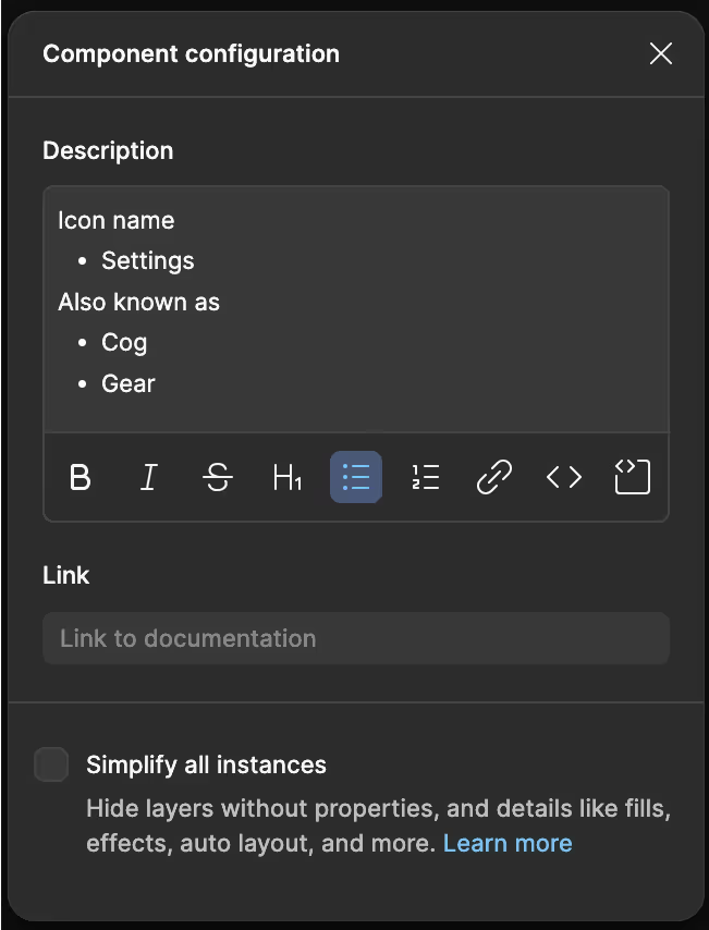
When it comes to icons it is not easy to guess by which name a designer might search. For example take a look at these 2 icons.
Here’s the convention we followed the we would add name of the icon first and then we would add any alternative names. I expect this list to grow as other designers on the team were also encouraged to suggest alternative names they thought were missing.
If you want to see a representation of before and after of this icon library looked like in action here’s the Figma file
Scalable icon system
This was really fun experience which gave me an opportunity to learn about figma vectors and instance swapping properties. If you’re organizing and maintaining your organization’s design system hope this article helps you as well.
Thank you for reading!
